

Anti-Action
Pictures from an exhibition of abstract painting by women artists from Japan

Some of you will remember a 2024 exhibition about women painters from Britain, Now You See Us, which I wrote about here.
Towards the end of last year I saw another fascinating ensemble exhibition, this time in Tokyo, dedicated solely to female artists: Anti-Action: Artist-Women’s Challenges and Responses in Postwar Japan at the National Museum of Modern Art. 1
This exhibition was much more limited in its scope than the British one and focused on artists working in the 1950s and 60s. Most of the paintings were abstract.
The exhibition was shaped by a 2019 book by critic Izumi Nakajima, Anti-action: Post-war Japanese Art and Women Artists. The basic thesis is that female artists attracted attention in the realm of avant-garde art in that period until the stylistic concept of “action painting” was introduced, when women painters disappeared from most criticism. According to Nakajima, the notion of “action”, suggesting boldness and strength, was closely associated with masculinity, causing a swing back to the “traditional gender order”.
For me, the disappearance from view of these artists is the real story. “Anti-action” is a good title, but I feel that focusing on the techniques of action painting as the root cause of their eclipse makes for a slightly tendentious and drily technical thesis on which to hang an exhibition. In any case, I sometimes wonder whether curatorial narratives survive for long after a glimpse at the first room of an exhibition.
The curators started the exhibition with one work each by all 14 artists, usefully allowing for an overview of their work before looking at the individual artists in more detail. Below are some of my favourite works.
For once, photos were permitted, though not for all artists. Yayoi Kusama, undoubtedly the most famous of these artists outside of Japan, was one of those whose works were protected against photography.
In a later post, I plan to cover some of the other artists whose work I especially enjoyed.
Art critic Harold Rosenberg apparently coined the term “action painting” in 1952 to “describe the work of artists who painted using bold gestures that engaged more of the body than traditional easel painting. Often the viewer can see broad brushstrokes, drips, splashes, or other evidence of the physical action that took place upon the canvas.” 2
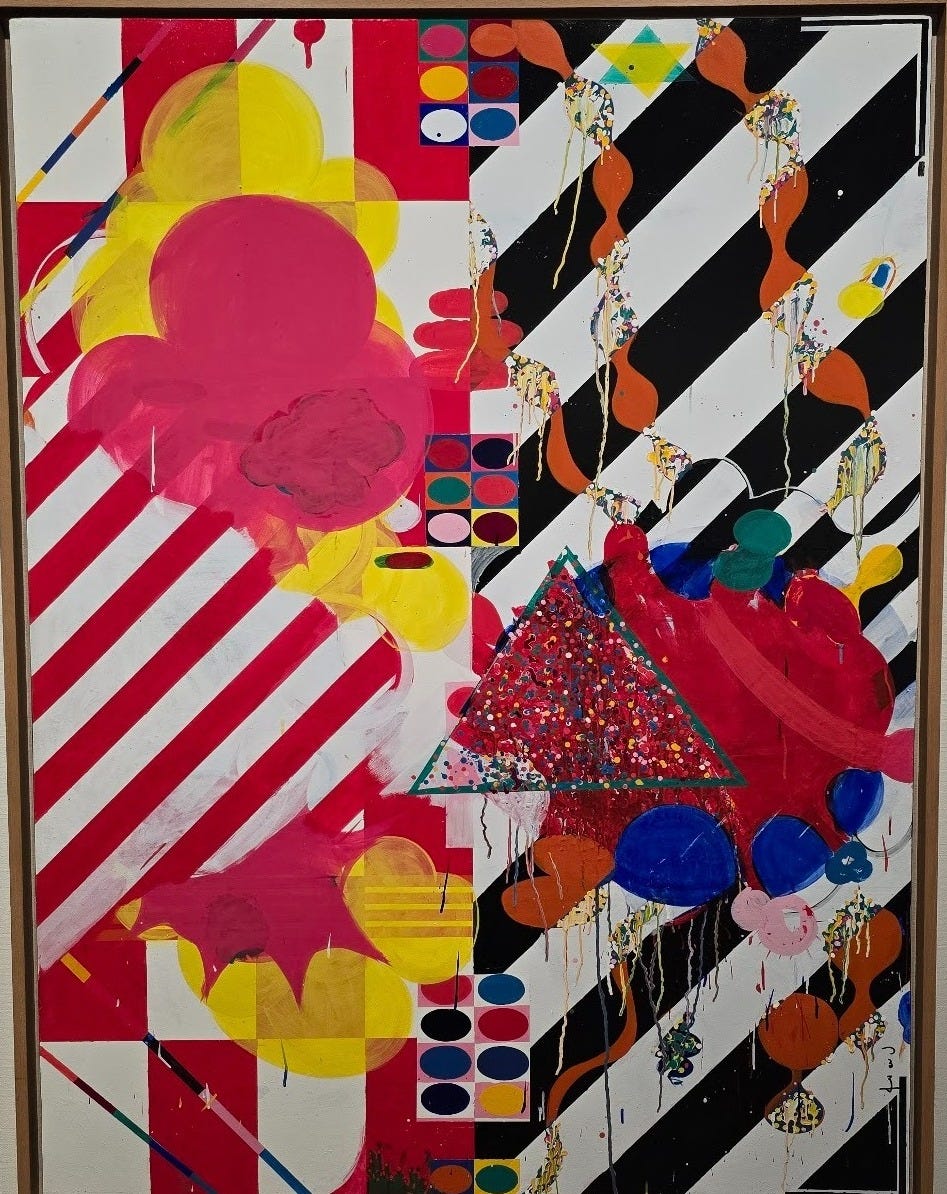
In Yamazaki’s Work from 1964, the first painting I observed, I thought I could detect plenty of evidence of the physical action that may have taken place on this canvas, including the many drips of paint. I’m no expert, but this struck me as an immediate contradiction of the curatorial thesis mentioned above. Interestingly, though, this work had been chosen as the poster painting for the exhibition.
In any case, it was at this point that I decided to stop thinking about “anti-action”. I concentrated instead on appreciating the works simply for the effect they had on me.
I then came across Yamazaki’s 1961 painting, also called Work, which I greatly enjoyed. 3
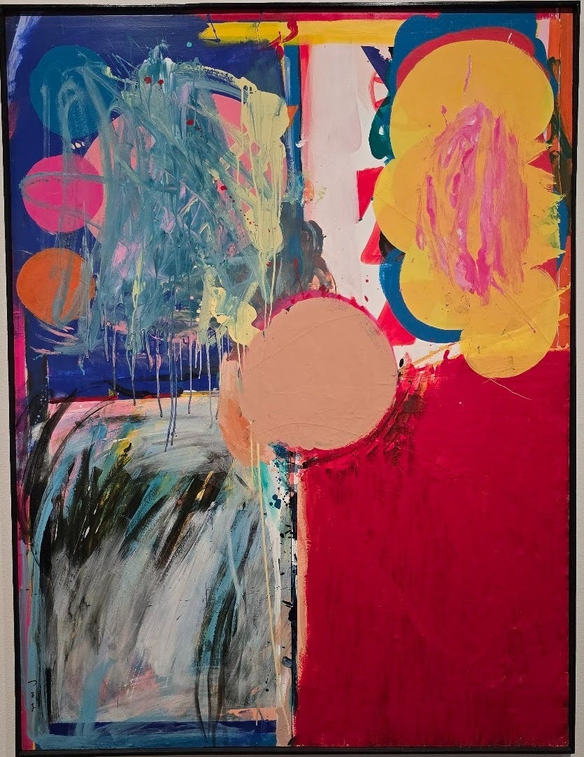
I found its organisation intriguing and enjoyed the contrast in shape, colour and mood between the five different sections. The colour really leapt off the canvas.
In the essay by Izumi Nakajima in the beautiful exhibition catalogue, she gives some context to Yamazaki’s use of bright colour: “Along with neon signs, nothing had changed the postwar urban landscape in Japan more profoundly than the variety of glossy paints in bright colours. While wartime restrictions had imposed severe controls on the use of paints, new manufacturers developed numerous products one after another after the war. ” Nakajima describes Yamazaki as having been “attracted to the texture of industrial materials.”
There wasn’t much sculpture in the exhibition, but I was drawn to Aiko Miyawaki’s 1967 Work in brass:
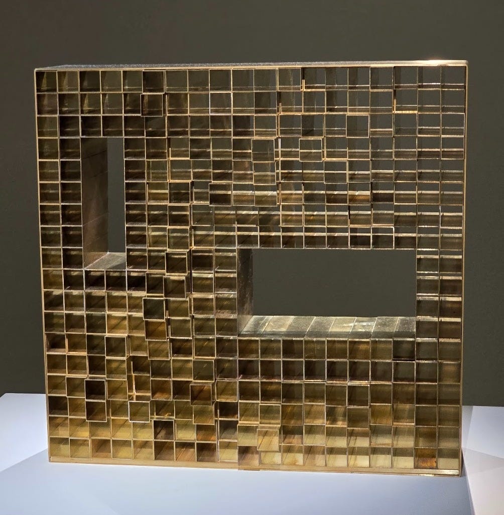
There was something about it that suggested language to me (perhaps a digital language?), and this added to the piece’s allure.
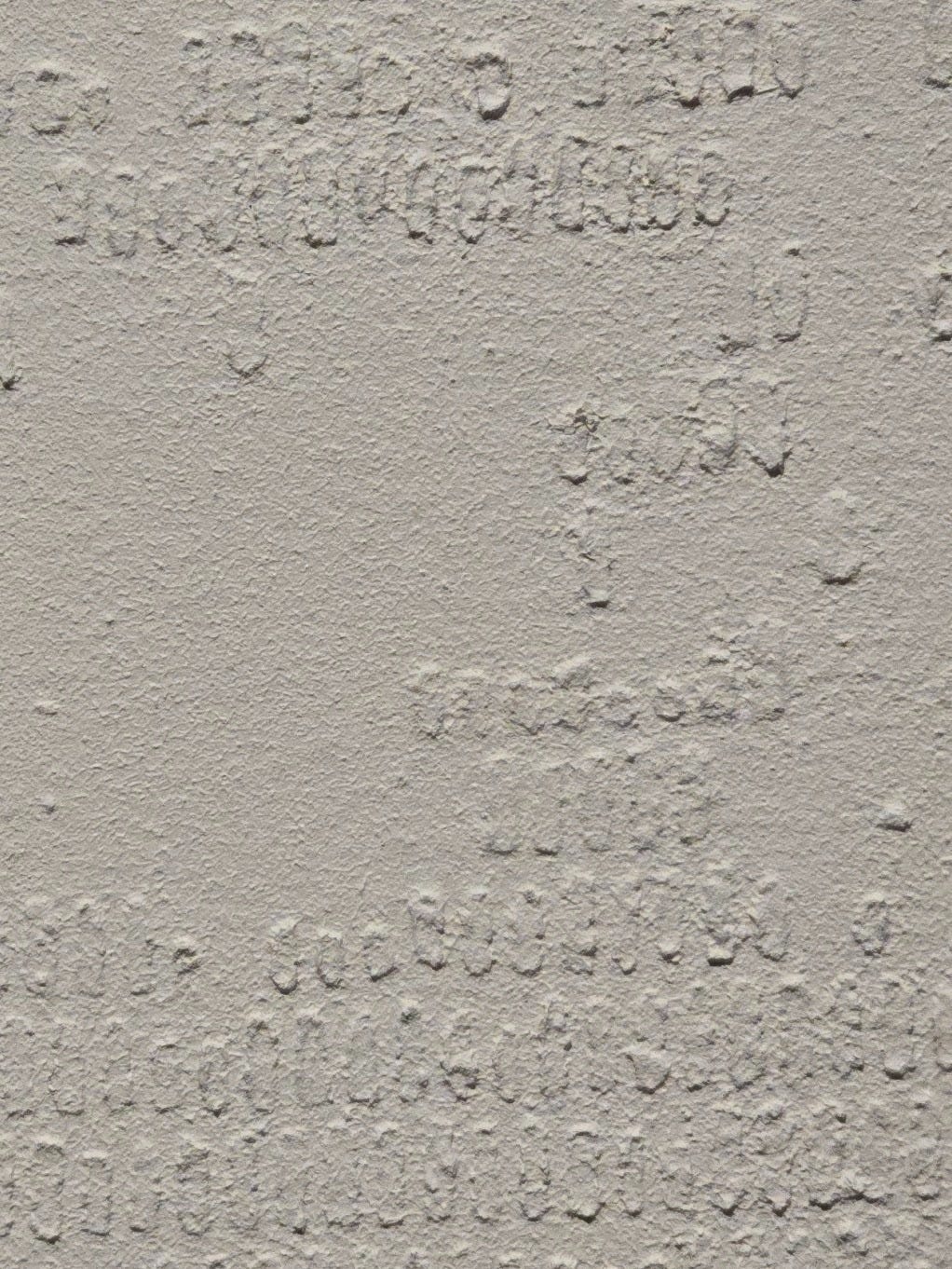
And her 1960-61 canvas Work seemed to go further in the direction of communication. It not only conjured up the image of a map but also made me think of braille.
For me, one of the boldest works in the exhibition was Work A; Gold (1962) by Atsuko Tanaka:
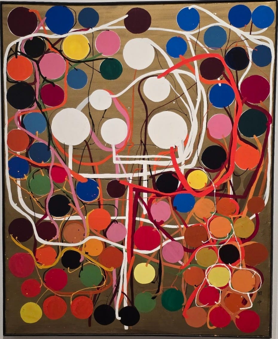
The connection between the regularly formed circles via “organic” and uneven lines created an impressive sense of balance, almost of harmony.
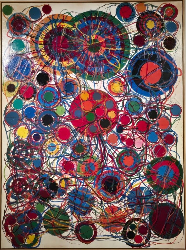
And in her monumental (wall-size) work from 1965-69, Gate of Hell, she ramped up not only the scale but also the power and the intensity. Peering up at this canvas, I felt this to be an image of hell as entanglement and of continuous dazzlement...
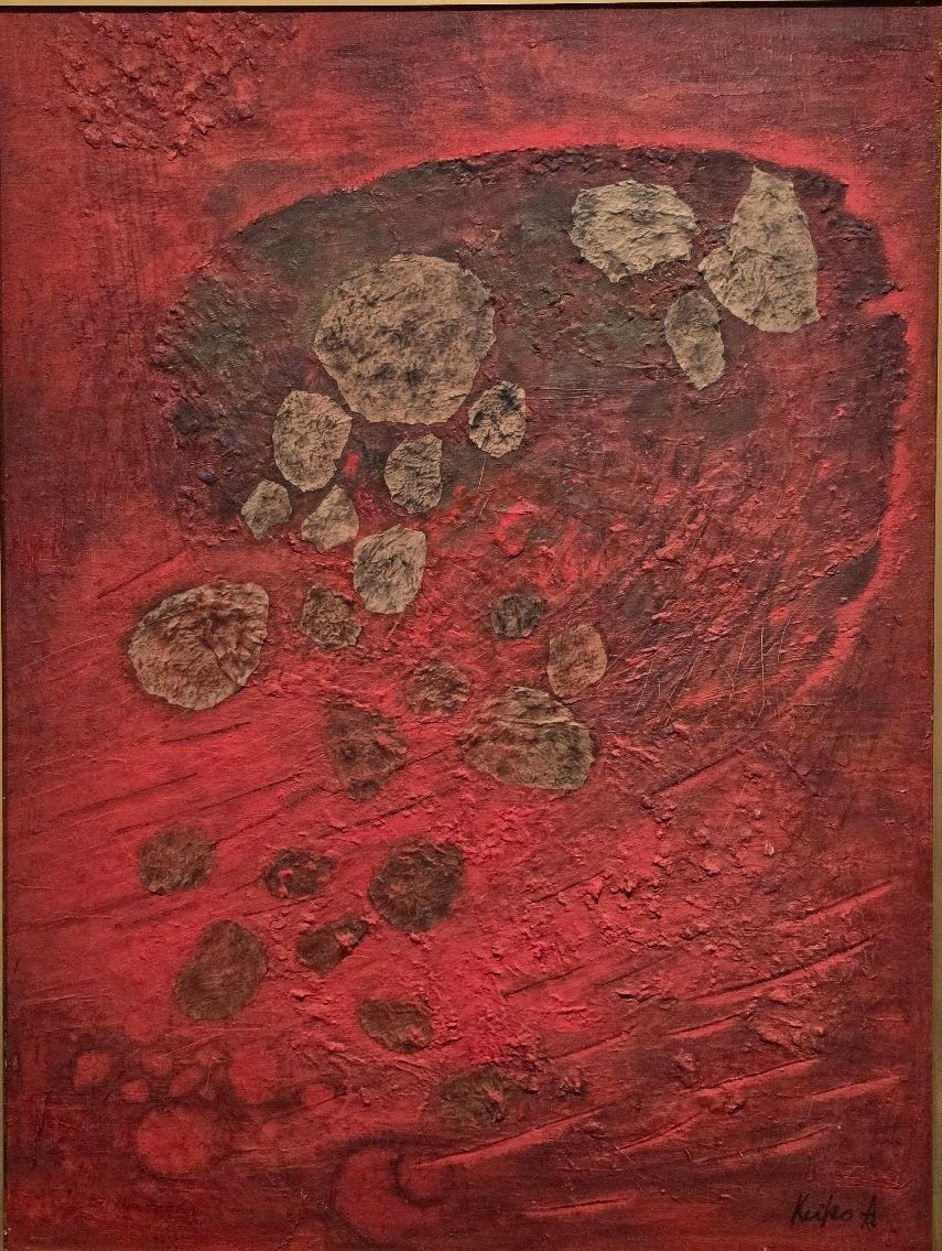
Keiko Akana 4
Finally, from this first look at the artists in this remarkable exhibition, here is work by Keiko Akana, whose Objects in the Space (1958) I found to be one of the most haunting works on display. There’s a palpable sense of foreboding or tension in the scene. Is something about to happen? Is the giant object a boulder in a huge hand? Or is the work to be understood simply as abstracted emotion?
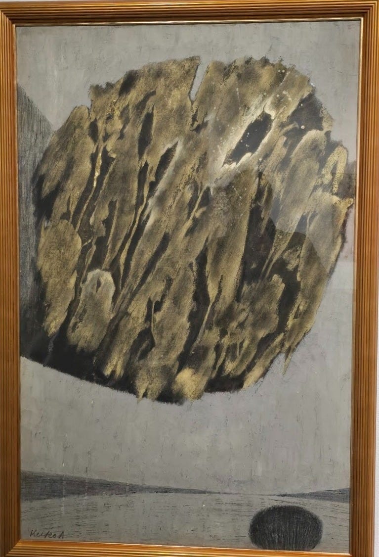
The smaller dark shape suggests a clump of trees, or then again, just a fuzzy form… are the two objects competing for the horizon, or is there a more subtle dance going on here? When I looked at the painting from the point of view of the black clump, I saw it as a viewpoint for the area beyond it, which suggests a landscape. But where I stepped back, the other larger object complicated that view. The effect was to keep the viewer almost literally off balance.
The essay by Izumi Nakajima in the catalogue describes her work in this way: “Akana’s works seem to be aimed at representing not so much presence as emptiness.” And here, that sense of emptiness is compelling.
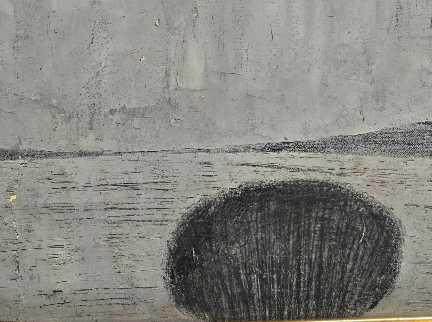
There was also something ominous about Akana’s Growth I (1961). Whatever it is that’s growing here, it brings little sense of promise or progression. It was a little unsettling to gaze at this canvas. But the gorgeous use of red kept me enthralled.
My thanks to Deborah Vass for encouraging me to write about this. Deborah’s own work is beautifully summarised in this essay.
For some reason, many of the paintings were titled in this unrevealing way.
Unfortunately, I can’t find much info online about Akana. According to the curators, she studied fashion design during the postwar era, then decided to pursue painting after a further period of study. In the late 1950s, she began producing abstract paintings, but in 1961, she stopped exhibiting her work. Later, she studied metal engraving and returned to the art scene in 1975 with a solo exhibition focusing on copperplate prints. Her work deserves to be better known.
Your posts always provoke me to thought, Jeffrey, this time, two in particular. You wonder "whether curatorial narratives survive for long after a glimpse at the first room of an exhibition." You offer good cause for the severity of that conjecture about this exhibit. But I wonder how much, less severely, they survive the exhibit. Surely, some art historian has examined the record of curatorial narrative actually exerting influence over the reception and historical course of art?
I also recall our talking titles very recently. I forget whether we got to mentioning titling of abstract art. The "works" here are excellent examples of the clearly very determined effort to abstract the titles, meaninglessly, themselves, so as not to impose an idea through language onto the reception of the artwork, by articulating an essence in the title. The only one that clearly directs a response is "Gates of Hell," and, indeed, you and I had that response.
These abstracts I would not have seen without your essay, Jeffrey: eye opening!