As a child, when asked what my favourite colour was (why do we ask children that?), I always answered, without hesitation, “blue.” When my parents built an extra room in our small farmhouse so that my twin brother and I would no longer need to share a room with two other brothers, it was painted light blue, and I felt as if I were sleeping in the sky. Later, my university team’s colour was dark blue, and a few years ago I remember cheering the Dark Blues to victory under a bridge on the Thames in the annual university boat race.
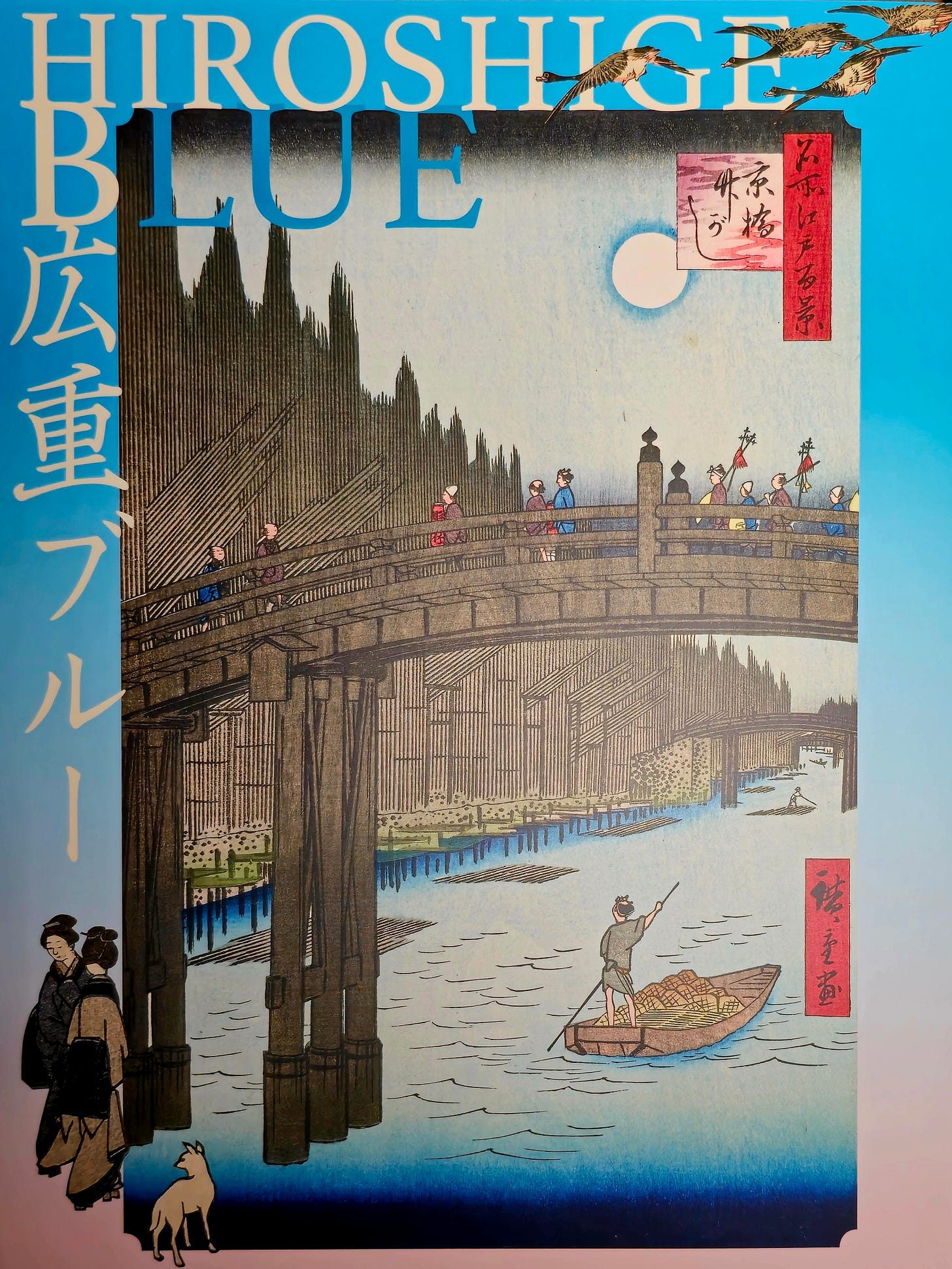
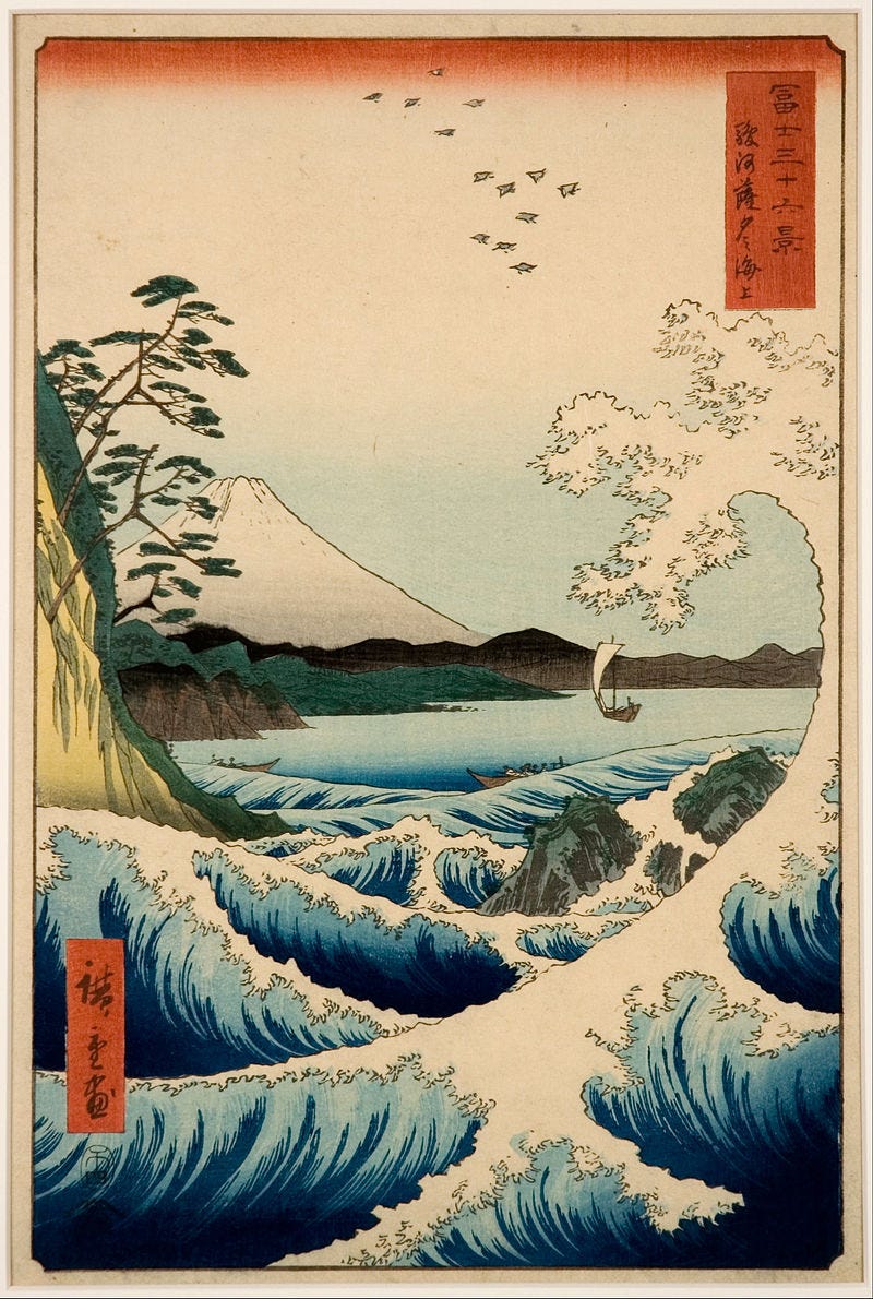
Very recently, I was lucky enough to see a gorgeous exhibition at a small museum in Tokyo (see poster above) that explored the use of the colour blue in the prints of Hiroshige. It was a true delight to see many of these gorgeous blue-inflected works together.
Utagawa Hiroshige (1797–1858) is considered the last great master of ukiyo-e (“pictures of the floating world"), and following the Paris International Exposition of 1867, where Japanese artworks were displayed and widely admired, he and Hokusai, among others, became an important influence on a number of major European artists. Hiroshige is best known for his landscapes, which are not always typical of ukiyo-e in terms of subject matter. You can see more of his work via this link.
And one of the most striking and admired things about his landscapes is his use of blue.

Blue had long been an important colour in Japanese art. One of the ways it was traditionally produced was using the plant Commelina communis, known as the Asiatic dayflower (because its bloom only lasts for a day).
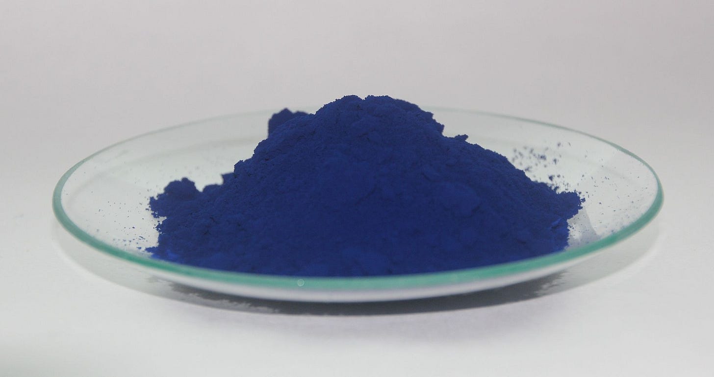
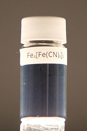
But Hiroshige was among those painters to see the potential of what was called in Japan ベロ藍 ("Bero-Ai”), meaning “Berlin blue," more commonly known as Prussian blue.1
In the 18th century, a chemical consisting of iron cations, cyanide anions, and water was used to dye the uniform coats for the Prussian army. 2
It was discovered by chance—out of the blue, as it were—by a dye maker in 1704, 1705, or 1706 (I’ve read three versions). The colour first reached Japan in 1747 but was very expensive.
By the early 1800s, a Guangzhou entrepreneur effectively reverse engineered the formula, and the dye became cheaper. This allowed Hiroshige and Hokusai to make extensive use of the colour in what would become some of their most celebrated work.
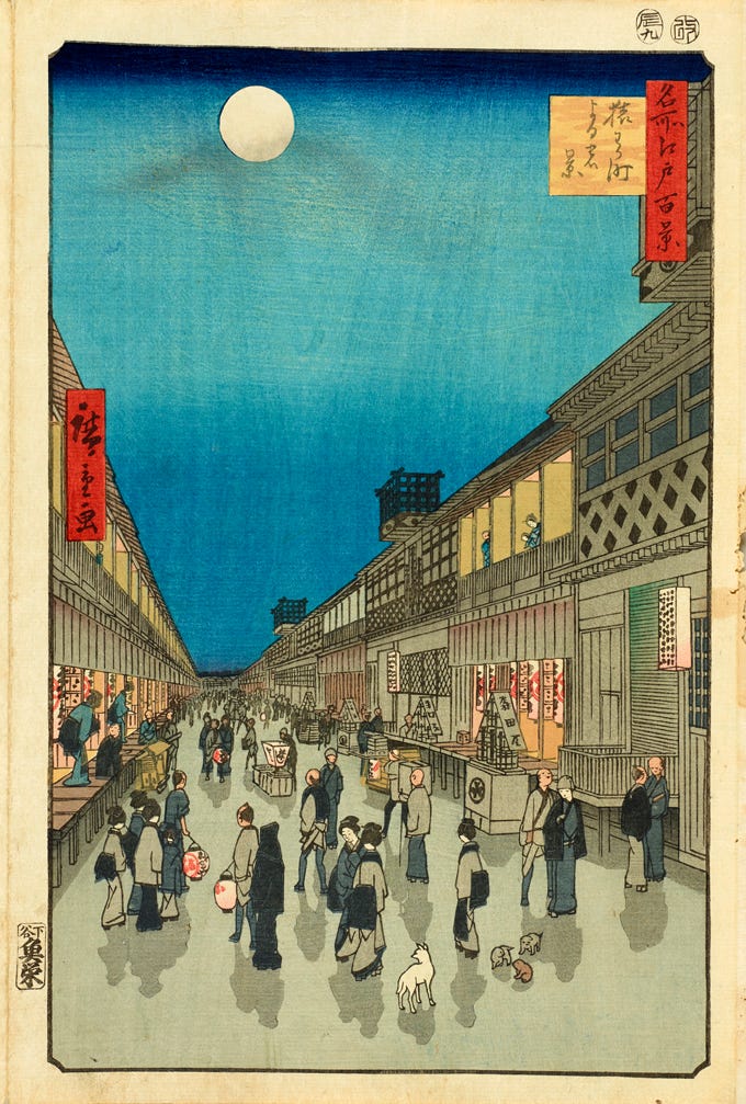
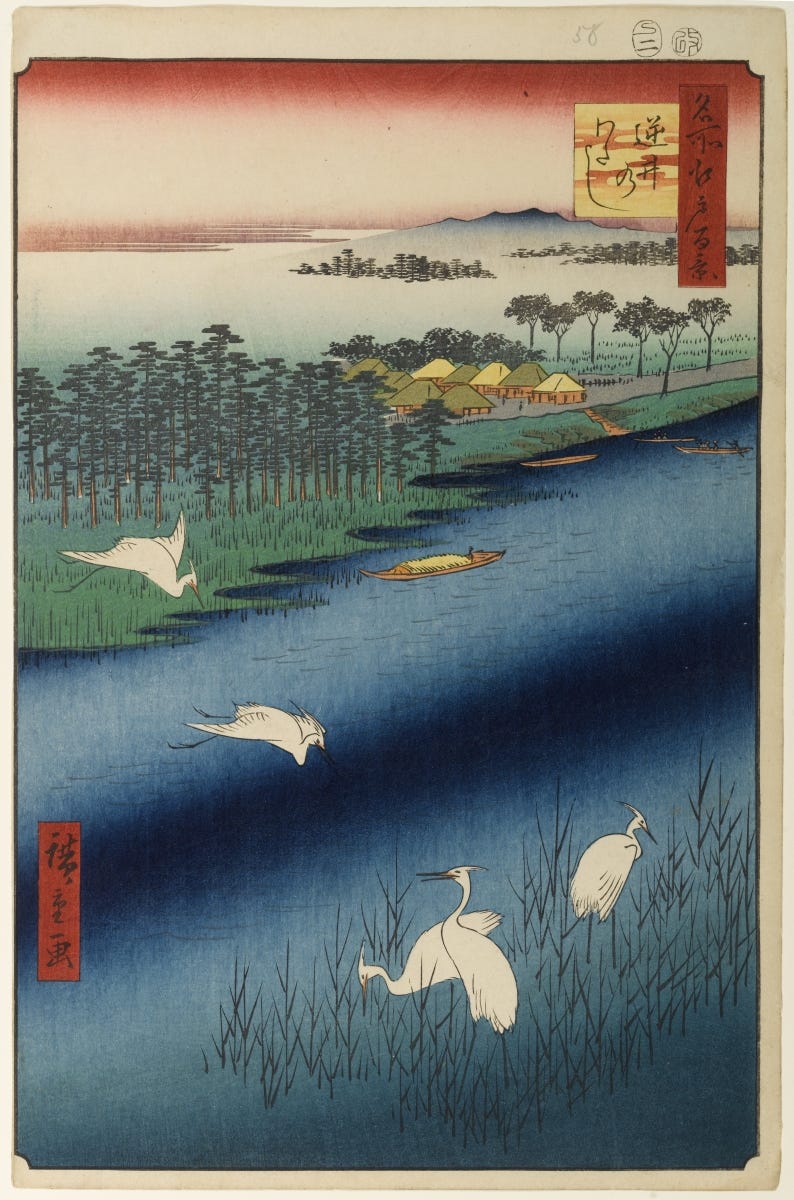
A feature of the prints of Hiroshige are the gradations of blue that he achieved to add beguiling depth and charm to his landscapes and seascapes.
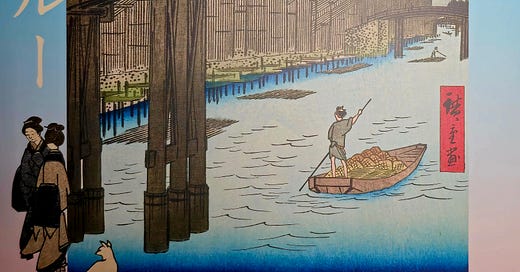
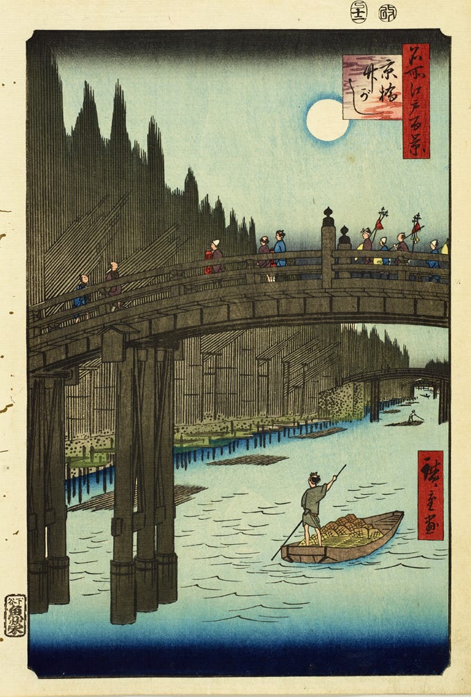
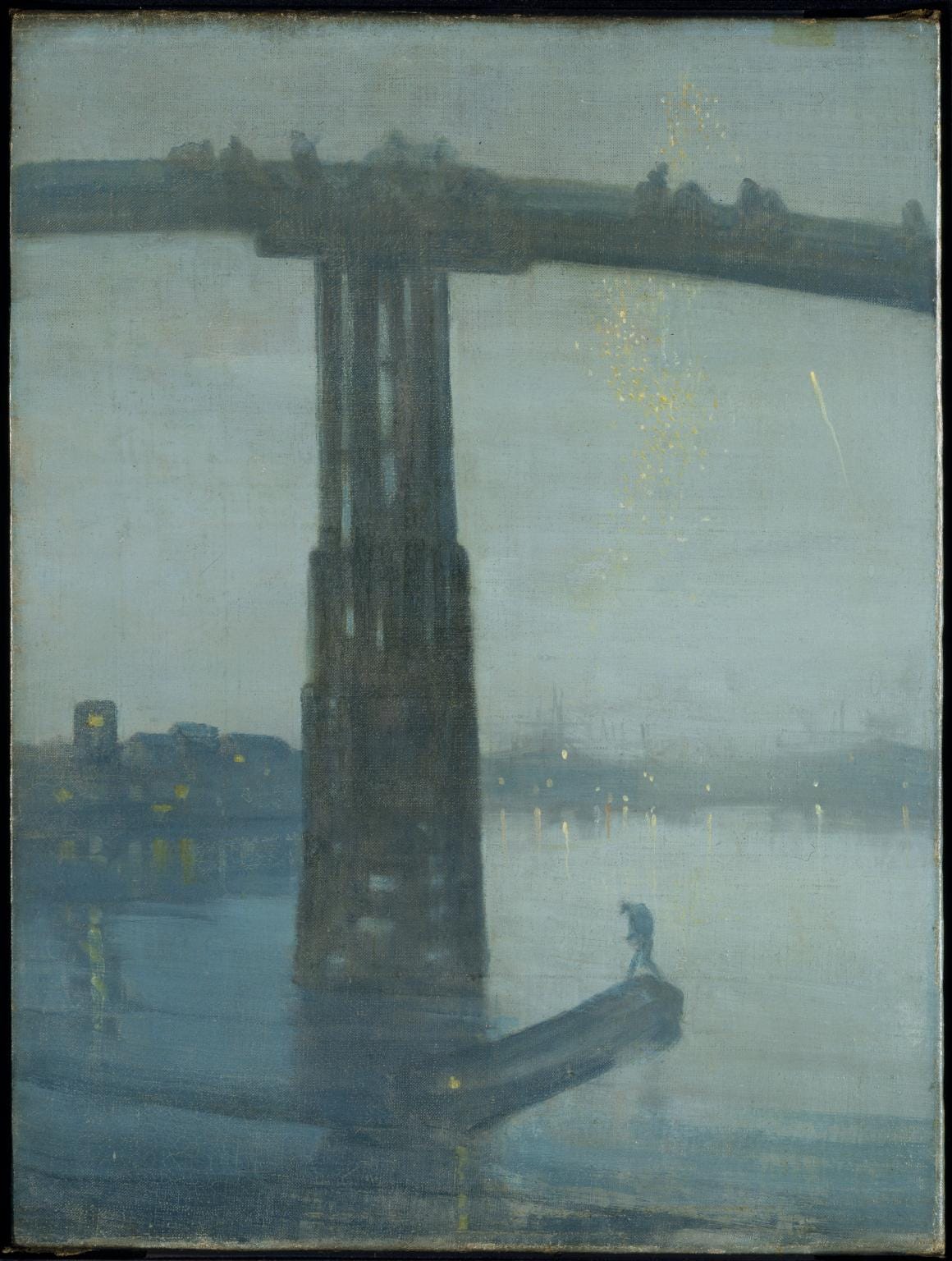
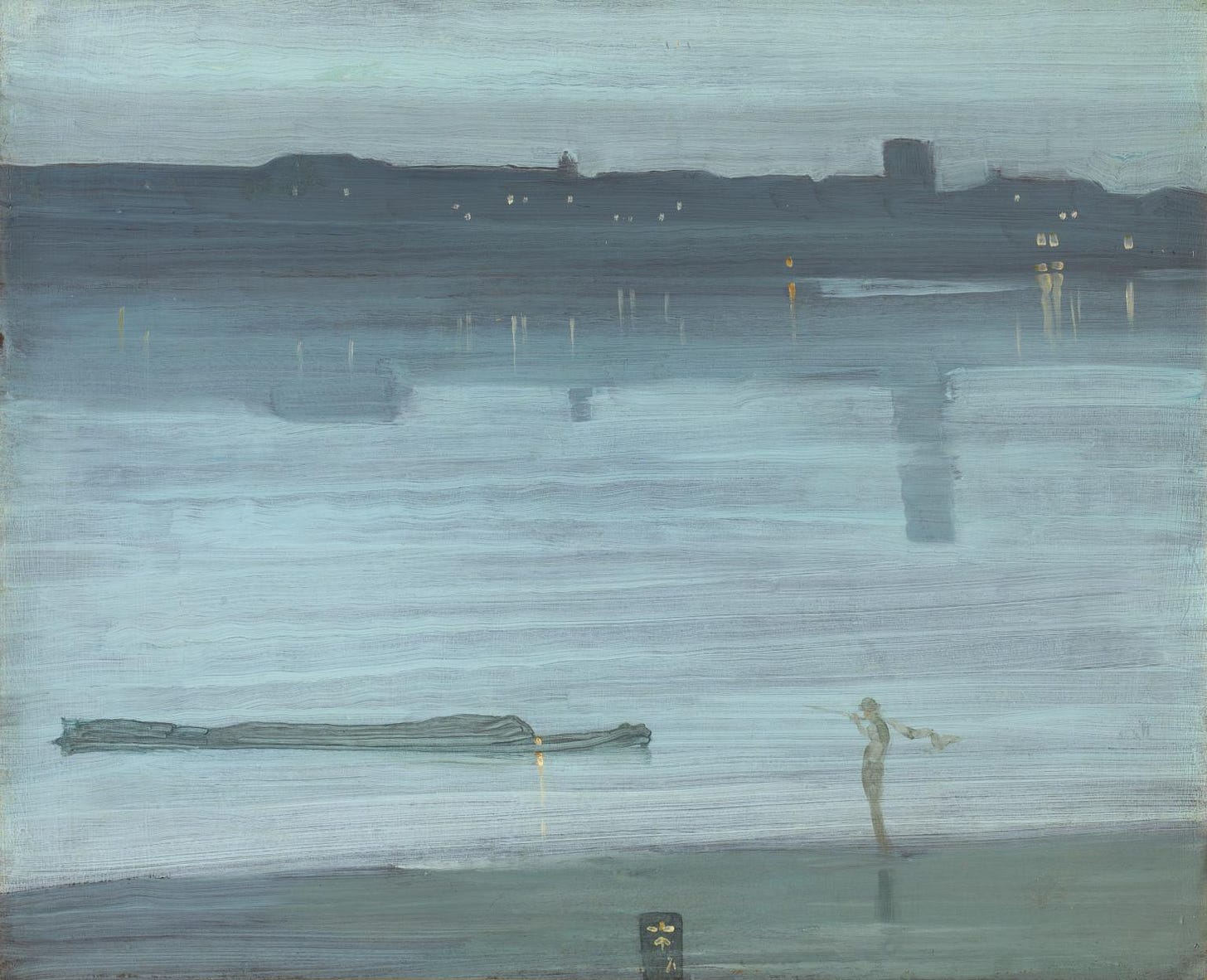
This is notable in one of his paintings, Kyōbashi Bridge and Takegashi Bank (featured in the poster of the exhibition and reproduced immediately below), which influenced in colour and composition a work that hangs in Tate Britain, on the banks of the Thames; Nocturne: Blue and Gold—Old Battersea Bridge (c. 1872–5), by James Whistler (see below the Hiroshige).
I was at the Tate earlier this year, and while I wasn’t able to see this work, I saw a similar work by Whistler depicting a blue haze over one of my favourite rivers:
Seeing Hiroshige’s own gorgeous painting this autumn felt like a link to my own past, and it was even better to see it surrounded by so many other wonderful examples of this master painter’s art.
Hiroshige’s painting of Kyōbashi Bridge was part of a famous series of prints he made called One Hundred Views of Edo. Edo was the name, until 1868, for the city that is now Tokyo. The old Edo charmingly depicted by Hiroshige and others is long gone, but it lingers in many place names in the city and, of course, in the prints themselves.
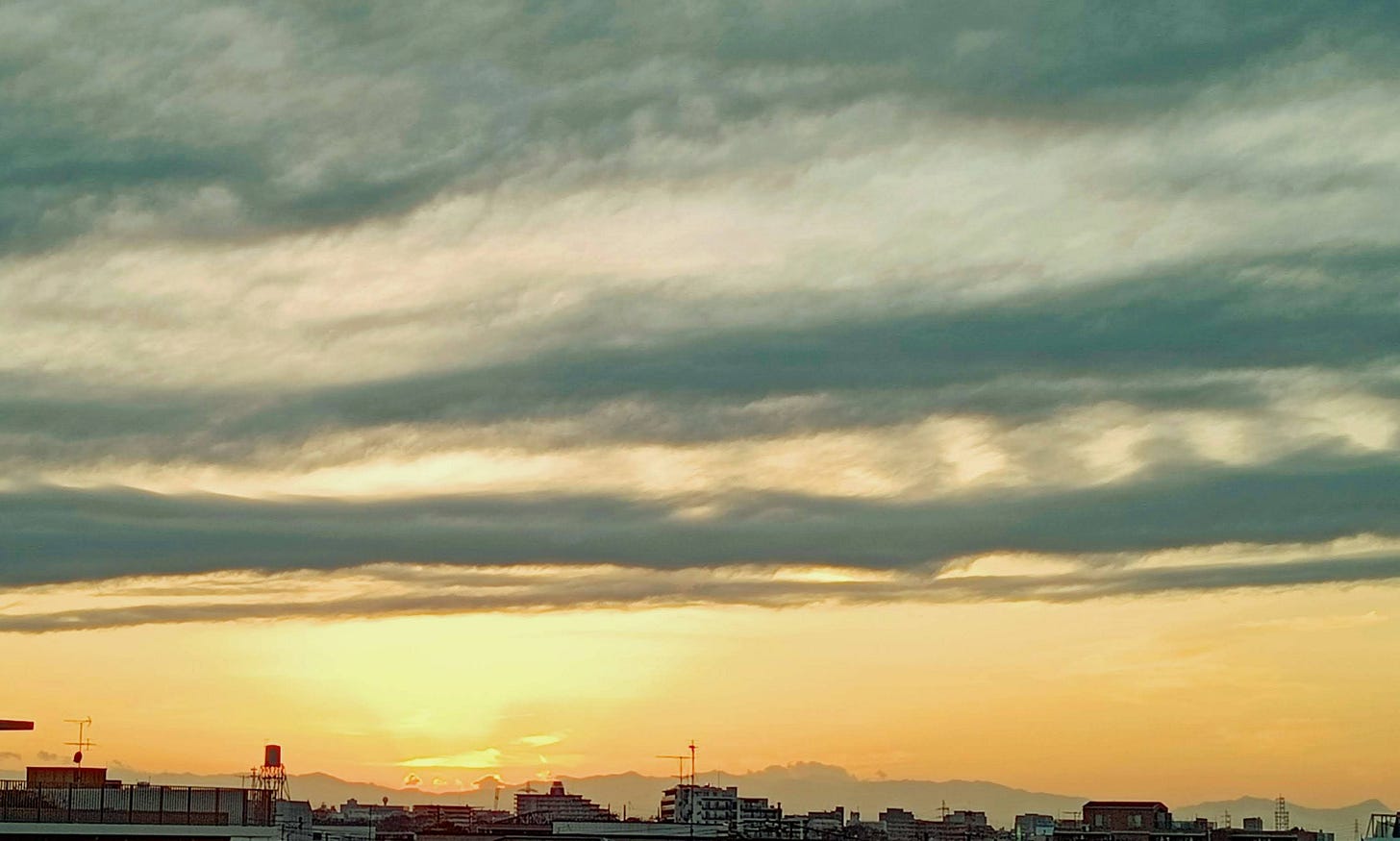
And from my tiny balcony in the modern city, peering out into the autumn evening, I almost feel I can see back in time to the Edo of Hiroshige as I watch the sun set over the pale blue hills that seem to float under the glowing sky to the west.
The colour has been given many names, my favourites being Brandenburg blue and Sarum blue.
The chemical has many uses. It’s a medicine (“antidote to heavy metal poisoning”—I don’t think they mean the music), and also it’s an ideal substance for use in sodium-ion battery electrodes.





What a lovely article. I read it this morning while sitting in my dove-blue kitchen, eating my breakfast from a white plate edged with cobalt blue on a faded-to-slate-blue placemat, looking outside at a cloudless sky through the crabbed bare branches of the horse chestnut tree.
I could go on. I won’t, except to say that the color blue fills me with rapture, as does this article. I’m not a visual artist, so I wouldn’t have been able to identify the pigment used in ukiyo-e as Prussian Blue, or understand its meaning in history or its chemical composition.
Thank you once again, Jeffrey, for a wonderful read.
Blue is my favorite color too and I love Hiroshige’s blues. Coincidentally, I’ve been wondering about a blue used in a style of South Indian gilded painting. It’s not a color but an emotion.